Our Work
What an upgrade can look like
Every business needs something different from its website. This page shows the design directions we work in, the specific upgrades behind them, and — in real numbers — the difference those upgrades make to enquiries, bookings and sales.
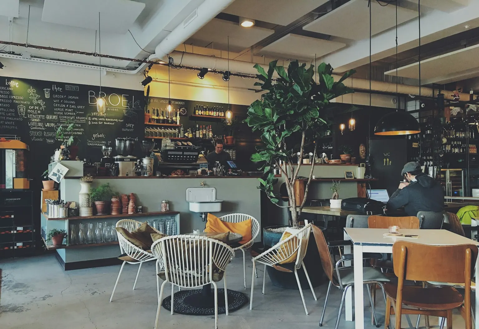
Design directions
Six directions, one goal: a site that suits your business
These aren't templates — they're starting points. The look, the words and the structure all get shaped around what your business actually does.
Warm & local
Suits: Cafés, trades, family-run businesses
Friendly colours, real warmth, and your opening hours and phone number where people can actually find them.
- Clearer navigation
- Mobile fixes
- Local SEO
- Click-to-call
Clean & clinical
Suits: Health and allied health practices
Calm, trustworthy and easy to read — with services, practitioners and how to book laid out plainly.
- Simple structure
- Accessibility
- Online booking
- Fast loading
Bold & modern
Suits: Fitness studios, creative businesses
High contrast and confident type that matches the energy of the business — without sacrificing speed.
- Modern design
- Mobile-first
- Instagram links
- Page speed
Premium & minimal
Suits: Law, finance, professional services
Restraint that reads as confidence. Lots of space, sharp typography, and copy that gets to the point.
- Copy polish
- Refined navigation
- SEO basics
- Enquiry forms
Friendly retail & e-commerce
Suits: Shops and makers selling online
Products front and centre, an obvious cart, and a checkout that works as well on a phone as a laptop.
- Product layout
- Mobile checkout
- Product SEO
- Faster loading
Booking-first
Suits: Salons, clinics, studios
When your business runs on appointments, booking shouldn't be three clicks deep. It goes front and centre.
- Online booking
- Mobile layout
- Google Business Profile
- Reminders
The upgrades
What we actually change — and why it works
Behind every direction sit the same six kinds of work. Here's what each one involves, what it looks like in practice, and the research on why it pays off.
A mobile-first layout
We rebuild the layout for the phone screen first — larger text, buttons a thumb can actually hit, and nothing that needs pinching and zooming to read.
For example: A café menu that needed zooming becomes a clean single column with “Call to book” one tap away.
60%+
of visits to Australian small-business websites happen on a phone — and Google ranks the mobile version of your site, not the desktop one.
Faster loading
We compress oversized images, strip bloated plugins and themes, and sort out hosting — the invisible work that makes pages appear straight away.
For example: A home page hauling 8 MB of full-resolution photos drops to under one, and loads before the visitor thinks about leaving.
53%
of mobile visitors give up on a page that takes more than three seconds to load. Google, The Need for Mobile Speed
Clearer navigation
Fewer menu items with plainer names, and the things people actually come for — prices, hours, how to get in touch — never more than two taps away.
For example: A nine-item menu full of “Solutions” and “Resources” becomes five items a first-time visitor understands instantly.
Up to 200%
the visit-to-order conversion lift Forrester attributes to a well-designed site over a poorly designed one. Forrester Research
A design that earns trust
Current type, honest photography and consistent colours. Not flashy — just visibly cared for, because visitors read your website as a proxy for your business.
For example: A 2015 image slider and clip-art icons make way for one clear message and a real photo of your work.
Nearly half
of people judged a site's credibility partly on its visual design alone — layout, typography, colour — in Stanford's study of over 2,500 web users. Stanford Web Credibility Research
SEO that gets you found
Descriptive page titles, tidy structure, location pages and a matching Google Business Profile — so Google understands exactly what you do and where you do it.
For example: A page titled “Home” becomes “Emergency Electrician Thomastown | Smith Electrical” — and starts appearing for the searches that matter.
46%
of Google searches are looking for something local — and most people never look past the first page of results.
An obvious next step
One clear action on every page — call, book or enquire — with short forms and phone numbers that dial when tapped, so getting in touch never takes hunting.
For example: A contact form asking eleven questions becomes three fields and a click-to-call number.
~40%
of online bookings are made outside business hours — enquiries a phone-only business simply never receives.
Where a figure links to a source, that's the study it comes from — go and read it. The unlinked ones are widely reported industry numbers we haven't traced to a primary source, so treat them as the ballpark they are, not as findings.
The difference it makes
What that looks like in numbers
Three worked examples — realistic businesses, deliberately modest assumptions — showing how the same upgrades turn into enquiries, bookings and orders.
Trades
The electrician with a 2016 website
Solid reputation, steady word of mouth — but a dated site that's unreadable on a phone, with the number buried in the footer.
- Mobile-first layout
- Click-to-call
- Local SEO basics
| Measure | Before | After |
|---|---|---|
| Visitors a month | 400 | 600 |
| Visitors who enquire | 1 in 100 | 1 in 40 |
| Quote requests | 4 | 15 |
| Jobs won (about 1 in 3) | 1 | 5 |
Four extra jobs a month. At a $500 average job, that's roughly $24,000 a year the old website was leaving on the table.
The package that fits: Refresh — from $1,190
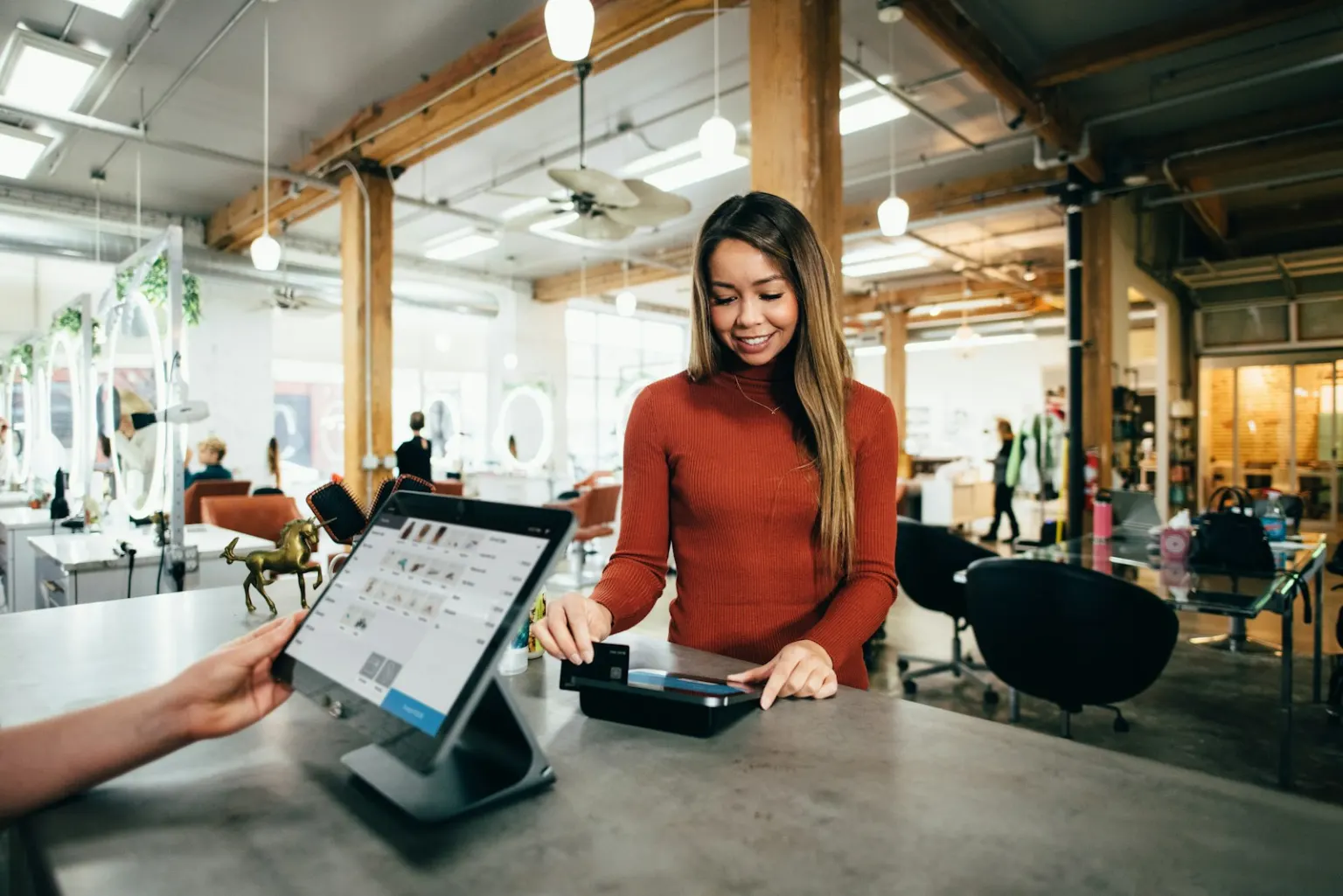
Salons & studios
The salon that only takes phone bookings
Full chairs and loyal regulars — but booking means ringing while they're open, and whoever's mid-cut can't always answer.
- Online booking front and centre
- Fresh, modern design
- Services and prices laid out plainly
| Measure | Before | After |
|---|---|---|
| Ways to book | Phone, 9–5 | Phone + online, 24/7 |
| Bookings a month | 80 | 104 |
| Booked after hours | 0 | ~24 |
Two dozen bookings a month from people who would never have rung. At $90 a visit, that's about $26,000 a year.
The package that fits: Full Build — from $3,490
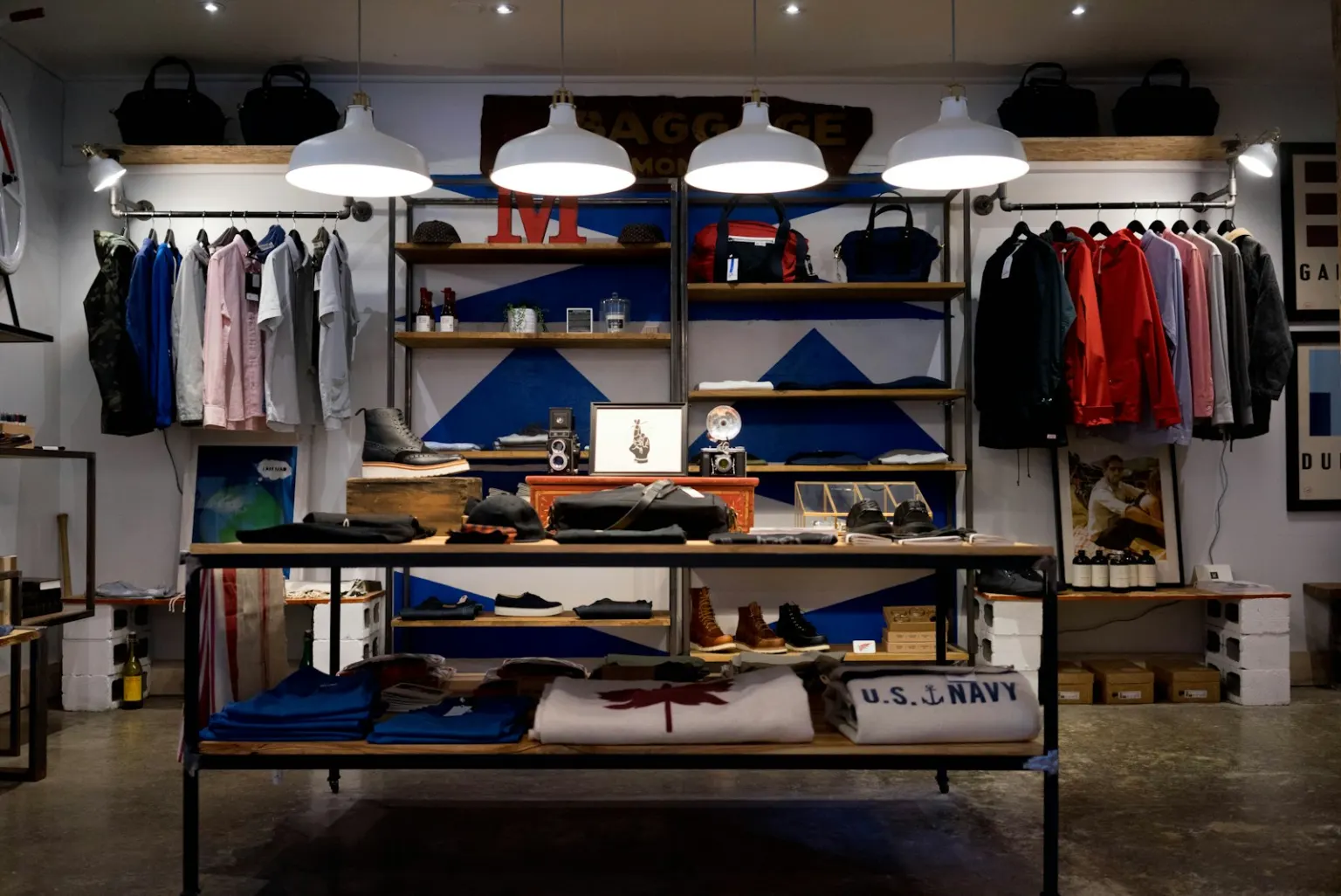
Retail
The homewares shop with a slow online store
Lovely products, decent traffic — but a home page that takes six seconds to appear on a phone, so half the visitors never see them.
- Page-speed overhaul
- Product SEO
- Mobile checkout fixes
| Measure | Before | After |
|---|---|---|
| Home page load time | ~6 seconds | Under 2 |
| Visitors who stay | ~470 of 1,000 | ~950 of 1,000 |
| Orders (2 in 100 buy, $70 avg) | ~9 | ~19 |
Ten extra orders a month without a single new visitor — around $8,400 a year, just from a website that loads.
The package that fits: SEO Boost — from $1,290
The honest fine print
These are worked examples built on the research above — not client results, and not guarantees. A website can only amplify what's behind it: it removes the friction that stops people finding, trusting and contacting a good business, but the quality of the work, the prices and how quickly enquiries get answered are still up to the business itself. Every business also starts from a different place — which is exactly what the free review works out: where your site is losing people, and what fixing it is realistically worth to you.
The transformation
From cluttered to clear
Whatever the style, the typical upgrade solves the same problems: too much on the page, too slow to load, and no obvious way to get in touch.
Before
Crowded menus, walls of text, and the phone number buried at the bottom — if it's there at all.
After
One clear message, one obvious action, and room for everything to breathe — on any screen size.
These are directions, not destinations
This page shows the styles we work in and the maths behind the upgrades — your website gets its own tailored plan, written for your business after the free review.