The benefits of a website that's easy to navigate
Navigation is the unglamorous part of a website — until it goes wrong. A confusing menu doesn't just annoy people; it quietly redirects your enquiries to whoever's next on Google. Here's what clear navigation earns you, and how to check yours.
4 min read
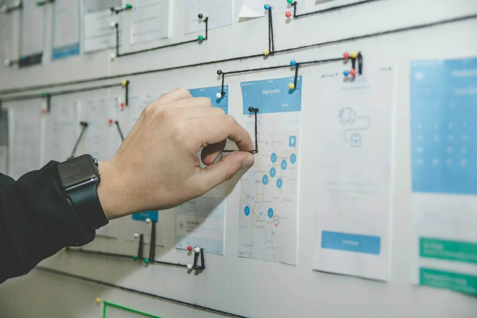
Fewer lost enquiries
Every visitor who lands on your website is a few clicks away from becoming an enquiry — or from giving up. Navigation decides which. When someone can't work out where to click, they don't knuckle down and search harder. They leave. On a phone, with a dozen other tabs open, they leave even faster.
The brutal part is that you never hear about it. A lost enquiry doesn't email you to explain that they couldn't find your services page. The only evidence is a quiet phone — and it's easy to blame the market, the season, anything but the menu. Fixing navigation is often the cheapest way to get more enquiries from the traffic you already have, because you're not buying new visitors; you're simply not losing the ones who already came.
Easy to find means easy to trust
A tidy, logical website sends a message before a word is read: these people have their act together. Customers can't inspect your workmanship through a screen, so they judge by proxy — and your website is the biggest proxy they have. If the menu is coherent, the pages are where you'd expect, and the contact details are one tap away, they extend that same confidence to your quotes, your schedule and your work.
The reverse is just as true. Dead links, orphaned pages and a menu that reads like a filing cabinet nobody has cleaned out suggest a business that's stopped paying attention — even when nothing could be further from the truth.
Simple menu principles
You don't need a design degree to get navigation right. A handful of principles cover almost every small-business website:
- Fewer items. Five to seven menu items is plenty. Every extra item makes all the others harder to see. If two pages could reasonably be one, make them one.
- Plain labels. “Services”, “Pricing”, “About”, “Contact”. Clever names — “What We're About”, “The Craft”, “Connect” — force visitors to translate, and translation is friction. Say what the page is.
- Contact always visible. Your phone number or a contact button belongs in the header of every page, not just on a Contact page. When someone decides to get in touch, the next tap should do it.
- One obvious next step. Decide the single action you most want — call, book, request a quote — and make that button stand out everywhere. Ten equal options equal no decision.
- No dead ends. Every page should lead somewhere: towards contact, a related service, or back to the start. A visitor who hits the bottom of a page with nothing to click is a visitor you've dismissed.
Clear navigation feeds your SEO
Here's the bonus most owners don't expect: Google effectively navigates your website too. Its crawler follows your menu and internal links to discover pages and understand how they relate. A clean structure — home page, clearly linked service pages, sensible page names — helps Google index everything and grasp what you offer.
Navigation also shapes the behaviour Google measures. When visitors find what they need, they stay longer, view more pages and don't bounce straight back to the search results. When they bounce quickly, that's a signal your page didn't answer the search — and rankings follow. Good navigation and good SEO aren't separate projects; one feeds the other.
A five-minute self-audit
Grab your phone, open your website, and be honest with yourself:
- Count your menu items. More than seven? Something can go.
- Would a complete stranger understand every menu label without clicking it?
- From the home page, can you reach your main service in one tap — and contact details in one more?
- Is your phone number visible right now, without scrolling or opening a menu? Can you tap it to call?
- Click every menu item. Do they all go where they promise?
- Scroll to the bottom of your busiest page. Is there a clear next step, or does the page just… end?
If you answered “no” or “not sure” more than once, your navigation is costing you enquiries — and it's one of the most fixable problems a website can have.
Want a second pair of eyes on your site?
Our free review walks through your navigation, mobile experience and SEO, then gives you a written mini-plan of what we'd fix first. No obligation.